Stay in the Loop
BSR publishes on a weekly schedule, with an email newsletter every Wednesday and Thursday morning. There’s no paywall, and subscribing is always free.
Gehry’s egalitarian future
The Philadelphia Museum of Art opens its new Frank Gehry interior Core Project

Frank Gehry’s architecture is often so radical in form that many worried what his Core Project would do to the interior of the Philadelphia Museum of Art. Last week, the long-awaited internal revisioning of the PMA opened to the public, and so far, the result is conservative and simpatico with the museum’s noble design. It also allows for greater freedom of movement between the galleries, creating a sense of community, not to mention convenience.
We’ve had plenty of time to envision Gehry’s changes to the PMA. The late, revered Anne d’Harnoncourt, museum CEO and director at the time, met with Gehry at his Guggenheim Bilbao Art Museum after its opening in 1997 and invited him to re-vision parts of the PMA space. He was formally announced as the architect for the project in 2006, and his plans for the renovations were given not long afterward. They showed clear respect for the museum’s original architecture, instead of a series of billowing rooms or walls tilted in every direction, like some of Gehry’s eye-opening and seminal work. Moreover, he was in a period of his career where he was conservatively designing more accessible and humanized spaces rather than architectural marvels. In the many years since the new designs were released, anxieties that the museum would become a strange and un-navigable place have been unfounded.
First impressions
I attended a May 6 press preview online, and the following day, I went to the museum’s long-unused North Entrance (opened as part of the revamp in 2019) to experience Gehry’s revisions for myself.
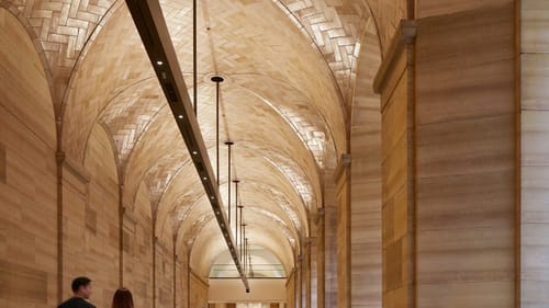
As soon as I got inside, I relaxed. Everything felt familiar—just another day at the PMA. Then, as I walked down the rehabbed Vaulted Walkway from the North Entrance, I admired the way Gehry had opened the arched ceiling and lit it beautifully. When I saw in the distance the exit to the gardens at the south end, I realized that Gehry had also opened the center of the museum to give greater access to all the parts, not only from north to south but also, as I was soon to discover, between the East Entrance with its iconic stairs and the west end’s Lenfest Hall admissions area.
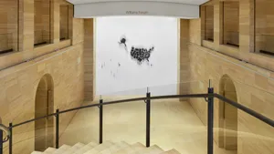
As I explored further, I saw how he had completely removed the auditorium and replaced it with an open multi-purpose space called the Williams Forum. An exposed stairway, totally out of place, was the only clear sign of Gehry’s postmodernism. And as I ventured further, I found that he had made the various galleries and gathering places more accessible. There are more elevators, and the experience of the separation between the east and west sides is replaced by a feeling of the museum being a unified space, a space that opens psychologically as well as physically, stimulating the possibility of dialogue and a sense of community.
As I took in some of the art, mostly focusing on the museum’s iconic collection of Impressionist and 20th-century work, I was gratified to see how the paintings were more or less in their familiar places, but the walls and lighting were brightened up and refreshed, and it felt more a place where you can move freely among the artwork and take in the whole as well as the specific works. Gehry and the PMA staff are taking the museum into the new millennium.

Art democratized
After enjoying my excursions around the museum, and hearing director and CEO Timothy Rub present the PMA mission at the virtual press conference the day before, I reflected on the larger implications of Gehry’s changes and my experience of them. I thought of the two imposing structures at either end of the Benjamin Franklin Parkway: City Hall, constructed in the earlier part of the Gilded Age, and the museum, built in the 1920s at the end of that same era. The two structures symbolized the wealth of the upper classes and the aspirations of a massive tide of immigrants. The acquisitive wealth and its oppressive imperialism provided the economic basis of art collection and exhibition at the time.
The time and space and economics of art have been changing in the century since the museum was built. We’re moving more and more into an age where museums, universities, foundations, and virtual spaces commission the art, rather than wealthy individuals. Art is becoming democratized, appearing on street walls, in coffee shops, and in museums that seek a contemporary flair. Today, a museum is no longer merely a space to house artwork, but is and should be a living, breathing community of curators, artists, and viewers, embodying ideals above commercial interests and striving to foster the development of art itself.
Similarly, Frank Gehry is taking the stentorian building of the Philadelphia Museum of Art and changing it into a more egalitarian and free-flowing space appropriate to the needs of the times we live in. That feels good, though I do wish the architect had brought more of his own unique and ground-breaking conceptions into the mix. Still, the underbelly of the museum extending below the outdoor stairs awaits his modifications, to create new gallery and storage space. The plans include a large window set within the “Rocky steps,” allowing those inside a view of the Parkway and City Hall. What else awaits? We can look at the blueprints, but we’ll probably reserve judgment until we see the finished product.
Image description: The new Williams Forum at the PMA from one level up. There’s a curving stone stairway in the foreground and two stories of symmetrical arched or square entrances on each side of the space, all in shades of warm beige. High up on the white wall opposite is an artwork that looks like a black map of the US.
Image description: The Vaulted Walkway at the PMA. A long walkway with smooth, warm-colored beige stone floors and pillars has a vaulted ceiling of matching shiny brick laid in a zig-zag pattern.
What, When, Where
The Philadelphia Museum of Art opened its new Frank Gehry-designed interior Core Project on May 7, 2021. 2600 Benjamin Franklin Parkway, Philadelphia. (215) 763-8100 or Philamuseum.org.
For information on the museum's accessibility features, visit the accessibility page or email [email protected].
Sign up for our newsletter
All of the week's new articles, all in one place. Sign up for the free weekly BSR newsletters, and don't miss a conversation.

 Victor L. Schermer