
Stay in the Loop
BSR publishes on a weekly schedule, with an email newsletter every Wednesday and Thursday morning. There’s no paywall, and subscribing is always free.
Letters from home
'Philadelphia Typography and Fine Art, Volume One,' by Cliff Ross and Philippe Jean
 Anndee Hochman
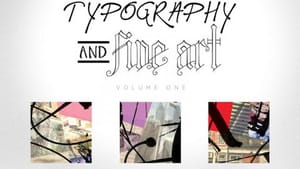
I perked up when I learned about the Print Center’s April 2018 launch of Philadelphia Typography and Fine Art, Volume One. The coffee-table book, co-created by designer/printer Cliff Ross and graphic designer/artist Philippe Jean, was designed, printed and published in Pennsylvania, and takes its cues from Philly's reputation as the "City of Neighborhoods."
My first bona fide summer job, as a copy editor on the graveyard shift at the Philadelphia Daily News, involved 4am visits to the basement press room, where guys (and it was all guys, alas) with ink-dark hands set sans-serif type into that day’s headlines.
A few years later, I became fluent in typesetting lingo—drop cap, point size, em space, kern—when I moonlighted at the Yale Daily News, using a machine the size of a spinet piano to transcribe students’ articles into primitive computerized files. I learned calligraphy. I check the back page of a book to see whether the text was set in Bembo (Ta-Nehisi Coates’s Between the World and Me) or Adobe Caslon Pro (Like a Beggar, by Ellen Bass). I am a typography geek.
The many faces of type
For Ross, letterforms are more than just strong, silent type. They’re an art form with personality. They can be funky, regal, whimsical, or cool, just like the Philadelphia neighborhoods that intrigued Ross when he first moved here from the Poconos in 1996.
Back then, he hung out in Philadelphia’s Northern Liberties, loving the walkability and surprise of urban streets. He opened an ad agency/design business in Easton, Pennsylvania in 2010; five years later, he opened a second office in the Fairmount section of Philadelphia. He also wondered, “What can I design that’s different, that people could connect with? Why not start making typefaces, a font file that people can use?”
For inspiration, Ross turned to the city and its streets. He began experimenting with typeface design, letting the character of various neighborhoods—the Main Line’s stately homes, the cocktail of contemporary art and Colonial history in Old City—inform the letters’ contour, thickness, and style.
What resulted, in 2017, was a menu of typefaces named for a range of Philly locales. One, his "North Philly" font, which alluded to boarded-up buildings, was removed after some controversy. Ross made the rest available, without charge, to anyone who wished to download (phillyfonts.com).
To date, the website has had 2,000 downloads, and the most popular choices are “Brewerytown,” “Fishtown,” “Center City,” and “West Philly,” along with a whimsical font called “Soda Tax” whose cartoonlike letters resemble soda cans, shaded to conjure an aluminum shimmer on one side.
Alphabet architecture
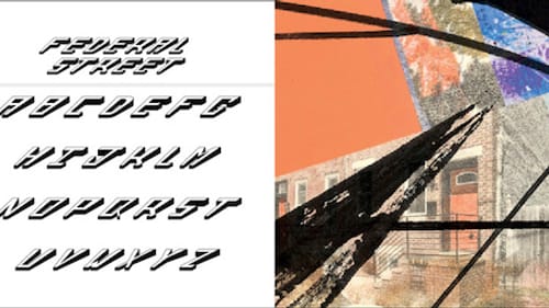
In some typefaces, the neighborhood connection is readily apparent: “Manayunk,” with its curve-topped Ms and Ns, echoes the arches of the bridge that spans the area’s canal. The letters in “Fairmount” contain narrow cutouts, like the slim windows of Eastern State Penitentiary. The “Center City” font looks like the type stenciled near construction zones.
I’m partial to “Old City,” whose verticals (the straight lines of a capital T, F, or L) end in a swish that makes them look brushed onto the page. The B and P of this alphabet incorporate a spiral flourish that evokes curlicues in old wrought iron.
In “Rittenhouse,” narrow tendrils wind the crossbar of the capital H and the cinched waist of the X, like morning glory vines snaking through the letters’ architecture. And the wide, blocky forms of “Schuylkill Expressway” evoke a bumper-to-bumper line of cars during rush hour.
“Swampoodle,” with its taillike verticals and lightly drawn shadow-lines that make each letter seem to vibrate, is one of Ross’s favorites. But I find it restless, hard to read. A more legible, stylish choice is “El Centro de Oro,” with its fluid, forward slant, and subtly tapered strokes.
For the book—a catalog, really, showcasing 15 typefaces—Ross turned to his former Philadelphia Weekly colleague Jean, who used photographs, monoprints, and acrylic overpainting to capture impressions of each neighborhood. In color, his prints have a grainy, faded feel, as if the image depicted is already in the process of ceding to something else.
On top of each print, Jean layered black brushstrokes evoking graffiti, calligraphy, shadows, architectural embellishment, or, in less-successful instances, a bit of ink that accidentally smudged the page.
Ross and Jean don’t expect the book to become a bestseller, or even a modest seller (it’s in stock now at the Print Center and will soon be available for purchase online). It’s meant to be a vehicle for Ross’s agency, a hook for new clients, and a celebration of an art form that often goes unnoticed.
In that, it succeeds. Paging through the book rekindled my love for letterforms and my affection for Philadelphia. It made me want to take a walk, with my iPhone and its soulless type tucked away in my pocket, while I “read” the variegated city, noticing signs and serifs, alphabets and architecture.
What, When, Where
Philadelphia Typography and Fine Art, Volume One. By Cliff Ross and Philippe Jean. Clifford Ross Enterprises, Inc., 2018. 40 pages plus a page of decals, hardcover; $18.75. Available at the Print Center, 1614 Latimer Street, Philadelphia. (215) 735-6090 or printcenter.org.
Sign up for our newsletter
All of the week's new articles, all in one place. Sign up for the free weekly BSR newsletters, and don't miss a conversation.